We have produced another task allocation list for the production of our trailer, magazine and poster. This is to evenly spread the work within the group and also means that we have clearly organised what needs to be done, to prevent us from falling behind.
Trailer Tasks
Directing - Beth and Ella
Filming - Charlotte
Lighting - Group
Editing - Group
Poster Tasks
Taking the photos - Beth
Production - Ella
Final Edits - Group
Magazine Tasks
Taking the photos - Beth
Production - Charlotte
Final Edits - Group
Thursday, 25 November 2010
Wednesday, 24 November 2010
New story board
 As a group we decided to work together to create a more detailed story board then our previous one, using our new shot list. We then filmed the shot list, ensuring that we kept each shot on for the time we have decided to show it for. With all 37 shots our film trailer is approximately 1:30, this is our new story board along with our recorded story board:
Wednesday, 10 November 2010
New Shot List
After loooking at our draft story board, we realised that we needed to add more shots to our shot list. This is our final shot list below, we will then draw up another story board including the new shots:
1. Production label flashes up
2. Pan of car driving past
3. Text - Starring Eleanor Failes
4. In the car found footage girls excited about weekend away
5. Establishing shot of house with car pulling into the drive
6. Girls walking into the house two remain by the car
7. Dialogue camera on one of the girls 'i have heard stories about this place'
8. second girl 'oh don't worry it will be fun'
9. long shot of girls walking in to the house.
10. Text - lets play a game . . .
11. Shot glasses birds eye view shot with ouija board visible when they bring down the glasses
12. Girls doing the ouija board hands on a glass on the board
13. one girl acts possessed
14. shot of two girls panicking
15. shot of the other two also panicking
16. Girl possessed laughs because she was joking,
17. 3 of the girls laugh along with the original one shown in a medium shot
18. another gets angry and throws board on the floor and says 'this isn't even working, lets just stop' other girls go silent shown in a medium shot
19. Phone rings close up
20. phone rings again and girls all look
21. Text - If your brave enough . . .
22. Close up of girl picking up phone hears white noise
23. Girl slams down phone close up
24. Lights turn off and all the girls scream
25. Flashing up images ... girl running up the stairs looking behind screaming
26. Girl runs in to kitchen
27. close up of opening the draw and frantically grabs a knife
28. girls turns around and holds up the knife
29. medium shot door slams
30. girl runs up to it to try and open it screaming 'What are you'
31. girl running through the woods looking behind her
32. Point of view shot chasing the girl through the woods
33. girl trips
34. Point of view shot getting closer to the girl zooms into her face as she screams 'Somebody help me'
35. Title 'Darkness Awakens' fades in
36. Tagline 'Do You Wanna Play' fades in
37. Release date '20th July 2011' fades in
Tuesday, 9 November 2010
Story Board
This is our first draft of our story board. When designing our story board, we have decided to use Longacre's theory, in order to help create our own model for analysis of texts. Longacre's theory consists of 8 stages, below is a list of these stages and how we have applied some of them to our own trailer planning:
Aperture: The "once upon time" opening- Girls happy and excited on the way down to holiday house
Exposition: Containing vital information about time, place, local colour and participants- arrive at house and talk about stories they have heard about the house
Inciting moment: The moment when things start moving in a story, when the predictable movement of the exposition is broken into- Begin to play ouija board
Developing conflict: When the action intensifies- lights turn black and fast, action shots begin
Climax: When matters come to a head and confrontation and "final showdown" become inevitable- one girl is chased into the woods
Denouement: A crucial final event occurs and makes resolution possible- girl falls to ground and stange thing approaches her
Final suspense: Details of the resolution are finally worked out
Conclusion: Some sort of satisfactory end is arrived at
The purpose of this story board was just to give us a rough idea of how our shots flow and whether or not we need to change it. After looking at this story board we were able to see that we needed to add more shots to our shot list, otherwise the trailer will not flow well.

Friday, 5 November 2010
Final text choices
We decided to come together as a group a make a final decision on the font choices that we are going to use for our trailer, poster and magazine cover. Chosing our final fonts and deciding where they best fit will help us to remain organise and also make it clear to us. We chose these fonts based on our research and what we felt worked best:
Wednesday, 3 November 2010
Textual Font
The style of font on any trailer, magazine front cover or film poster is extremely important and vital for the overall presentation of the product. It is essential that the text used easily portrays the genre of the film and works well with the initial story.
To give me a rough idea of what type of font i want to go with, we decided to all look on a website named "dafont.com" which has a wide variety of different styles of font. These are a few possible fonts that we may go with:
 This is the first possible font style, names Action Of The Time New by Galdino Otten. The reason i chose this one as a possible text font is because it has a sort of distorted look to it, which runs well with the theme of paranormal activities that occur in the film. As well as this parts of the text have faded in an almost decading way, acting as an immediate indicator towards death and decay, continuing the theme of thriller.
 This is my second possible font option, this one differs from the previous one

 This font is similar to the other distorted texts and it has a sort of eroded look to it. Even though the text is distorted and slightly blury it is still easily readible and will stand out from the rest of the page.
To give me a rough idea of what type of font i want to go with, we decided to all look on a website named "dafont.com" which has a wide variety of different styles of font. These are a few possible fonts that we may go with:
 This is the first possible font style, names Action Of The Time New by Galdino Otten. The reason i chose this one as a possible text font is because it has a sort of distorted look to it, which runs well with the theme of paranormal activities that occur in the film. As well as this parts of the text have faded in an almost decading way, acting as an immediate indicator towards death and decay, continuing the theme of thriller.
because instead of the distorted effect it leans more towards horror, and appears as if it is dripping. The effect of dripping immediately looks as if it could be blood, although this is a good option one negative side to it could be that it is leaning more towards the horror genre rather then the supernatural thriller.

This font is a lot less busy then the other two previous ones, but this is something which i think can work well, as it makes the title easy to read whilst still having an effect. In this case the text has an illusion as if the letters are cracked and broken which i think would relate well to the thriller theme. The bold writing also means that it will stand out well from the rest of the page and jump out of the screen.
 This font is similar to the other distorted texts and it has a sort of eroded look to it. Even though the text is distorted and slightly blury it is still easily readible and will stand out from the rest of the page.
Monday, 25 October 2010
Music choices
Music is an essential factor for almost all trailers and is extremely effective in building tension and creating an atmosphere. This is why it is crucial that we choose music which will fit in well with the trailer and will work well with the fast paced shots.
 After this, as a group we then shortlisted the song choices more. We did this by listening to each one carefully and deciding whether it was appropriate for our genre and whether or not it will work well we the speed of the trailer. We also had to chose more than one song choices to use it different parts of the trailer. Eventually we were able to come to a decision and finalise the music choices to four different song choices.
We decided to use the song Danger for the neutral track as we can cut the middle of it to keep it neutral with a mysterious undertone which is useful for the first few establishing scenes to create an eerie atmosphere. We then chose Finding The Body for the scence where Lucy pretends to be posessed, we chose this because it is a track which gradually builds up which is perfect for creating tension. Then we chose Condemmed as our fast tempo action piece for the sequence of action shots towards the end of the trailer, we chose this because it is fast paced which works well with the fast shots and it also builds up to a final climax which works well with the end shot of Ellie screaming. Finally we chose Grim Reaper as our mysterious end track and this was a quiet track which works well for background music and keeps the creepy atmosphere throughout the whole trailer.
When choosing our music we had a choice of 150 different music pieces. Beth then took them home and shortlisted it down to 50 of the best ones for our trailer.
After this, as a group we then shortlisted the song choices more. We did this by listening to each one carefully and deciding whether it was appropriate for our genre and whether or not it will work well we the speed of the trailer. We also had to chose more than one song choices to use it different parts of the trailer. Eventually we were able to come to a decision and finalise the music choices to four different song choices. 
We decided to use the song Danger for the neutral track as we can cut the middle of it to keep it neutral with a mysterious undertone which is useful for the first few establishing scenes to create an eerie atmosphere. We then chose Finding The Body for the scence where Lucy pretends to be posessed, we chose this because it is a track which gradually builds up which is perfect for creating tension. Then we chose Condemmed as our fast tempo action piece for the sequence of action shots towards the end of the trailer, we chose this because it is fast paced which works well with the fast shots and it also builds up to a final climax which works well with the end shot of Ellie screaming. Finally we chose Grim Reaper as our mysterious end track and this was a quiet track which works well for background music and keeps the creepy atmosphere throughout the whole trailer.
Thursday, 21 October 2010
Studio Logo

Charlotte has decided to draw up 5 potential logos that as a group we can decide on our favourite one, which we would like to carry further and make into our production label. Above are the five possible logos for our distributor company.
Before Charlotte could continue any further, as a group we decided to decide on what we wanted to call our studio name, and we decided that we wanted it to be called "E.C.B Productions" after each of our initials, Ella, Charlotte and Beth. This is similar to the way Warner Brothers. named there studio logo after the creaters of the production team.
After looking at all five logos we managed to narrow it down to a final two possible logos that we wanted to use for our production logo. These were the two we decided were the best ones:
We decided that the two best logo designs were the plain yellow star with E.C.B Productions beneath it and the logo with white stars encircling the production title:

We decided that these two would be most suitable for the logo because they both look sophisticated and both appear most realistic. Although the other ones were good, it seemed to me that some people may label them as "tacky and unrealistic" but the two we chose as our favourite look a lot more professional than the others. Both of the two logos include stars, which usually indicates fame and success, which is something that a production label wants to be associated with.

We decided that these two would be most suitable for the logo because they both look sophisticated and both appear most realistic. Although the other ones were good, it seemed to me that some people may label them as "tacky and unrealistic" but the two we chose as our favourite look a lot more professional than the others. Both of the two logos include stars, which usually indicates fame and success, which is something that a production label wants to be associated with.
The first logo with the single star consists only of two colours, yellow and white. The yellow is a bright colour, which stands out from the rest of the page and contrasts with the black page. In comparison to this the other logo consists only of white and black colours with 13 stars circling the production team name.
After analysing each logo we came to a decision that our final logo we would use will be the white a black one:

We ultimately chose to go with this logo because we felt that out of all five possible logos this one looks the most professional which is crucial for a production team logo. Another reason why we chose this logo was because we felt that the production team name "E.C.B Productions" stood out the most as the stars were encircling the name.
Now that we have chosen our final logo design, we will be able to take it further and make the template appear even professional, which is the ultimate goal for our logo design.
Wednesday, 13 October 2010
Film distribution
What does a distributor do?
- chooses which fims to distribute
- decides how many prints to make ( if a film has limited appeal only a small number of prints will be made)
- negotiates where and when the film is to be released
- sends trailers and publicity material to cinemas
- publicises the film through; posters, trailers, press/TV advertising, press releases etc.
The major distributor companies
The British market is dominated by six American distributors which consist of:
- UIP
- Buena Vista
- Warner Brothers
- Columbia
- 20th Century Fox
- Universal
These film distribution companies were responsible for 85% of British box office takings in 1999. The five majors primarily handle American films and have relationships with the key cinema chains and multiplexes in Britain. Warner Brothers is the only vertically integrated company of the five makin, distributing and exhibiting its own films, which overall means they retain maximum profits.
Tuesday, 12 October 2010
Settings
The setting for any film or trailer is definitely one of the most important aspects in creating mood and atmosphere. This is why it is particularly important that when choosing where we want our trailer to be set, we take into consideration certain aspects, such as:
- How the setting contributes to the mood and atmosphere
- Whether the setting acts as an indicator towards the genre
- Whether the setting is easily accessible and will not disturb other people
Initially we were sceptical of where we wanted our trailer to be set and possible places consisted off;
- woods
-house
-graveyard
-church
-hotel
-island
After researching more into our genre and deciding on the plot for our trailer we decided that the two suitable settings we are going to use are woods and a house.
We first began by looking at possible houses to film are trailer, we decided that we would only use either mine, beth's or charlotte's house, as it will be easily accessible for us.
House Number One:

This is our first possible house, it has a Victorian style and has a sort of homely feel too it. This could be misleading to the audience and create a falso sense of security, making them believe that nothing could go wrong at this house. This could be percieved in two ways, for example this could be a positive thing because it adds an element of surprise to the trailer, or this could be a bad thing because it is'nt a conventional thriller house.
House number two:


This is our second possible setting for the house in our trailer. This house has sa certain look to it which is often associated with horror/thriller movies therefore making it ideal for our trailer. The house is also detached from other houses which means that we would be able to film our trailer without disturbing the neighbours and also give the house an isolated effect.
Woods number one:

This is our first potential setting for our woods. This particular woods has a very creepy and erie atmosphere too it which is ideal for our trailer. However there is a downside to this particular setting because it is very open and isolated which means that it could be hard to film the scene through the woods, because it is very open plan.
Props
Props are an essential part of any film trailer and are crucial to creating an exciting, believable and vibrant setting for the characters. Props in a film trailer fulfil a wide range of roles, whether it be setting the scene for the characters or providing a subtle hint of things to come.
During our trailer we will be using many different props in order to create a visual impact to the viewers as well as a narrative one. It is important that we spend time thinking about what certain props we want to use and how well they will fit in with the trailer.
Phone
One of the most important props that we will be using includes the phone. The moment the phone rings in the trailer is a crucial part and should hopefully create a tense moment among the audience. Before deciding on a final one, we decided to look at possible phones we can use:


These three possible phones are very similar to one another, they are all black/silvery colours and are all very modern, high tech looking. Although these are what most modern day teenagers and homes may have, we don't feel they are necessarily right for our film trailer. The main reason for this is because the setting for our trailer is an old holiday house and having such modern day phones used in the house may not be right for the trailer. So we decided that our phone we should use will be the one below:

This is a classic old phone, and one we feel will be perfect for the setting and genre of our trailer. It is a phone that will fit in well with the rest of the surroundings and is also one which is different, therefore eye catching and should hopefully stand out in the trailer, and will be a prop that the audience will remember.
Car
Another vital prop in our trailer is the car that the girls will be driving at the beginning of the trailer. It is important that the car will reflect the girls personality and also be a realistic car for their age group.


These were 2 possible cars that we were going to use for that car part in our trailer, but there were a few problems which made us decide against them. For example both of these cars belong to people who are not appearing in our trailer which therefore means they wont be able to drive the car during the car scene.

We came to a conclusion that the car we want to use will be the fiat 500, we chose this car because we felt that it is suitable for our age group, as well as this it is also modern, stylish and spacious.

These are the four possible knifes that we looked at, the problem we had with some of them was they were either too large, too small or shaped oddly. We decided that the knife we are going to use is the knife 3rd in from the left. This knife looks conventionally suitable for a thriller movie and is the sort of knife you would expect to see in a trailer.
During our trailer we will be using many different props in order to create a visual impact to the viewers as well as a narrative one. It is important that we spend time thinking about what certain props we want to use and how well they will fit in with the trailer.
Phone
One of the most important props that we will be using includes the phone. The moment the phone rings in the trailer is a crucial part and should hopefully create a tense moment among the audience. Before deciding on a final one, we decided to look at possible phones we can use:


These three possible phones are very similar to one another, they are all black/silvery colours and are all very modern, high tech looking. Although these are what most modern day teenagers and homes may have, we don't feel they are necessarily right for our film trailer. The main reason for this is because the setting for our trailer is an old holiday house and having such modern day phones used in the house may not be right for the trailer. So we decided that our phone we should use will be the one below:

This is a classic old phone, and one we feel will be perfect for the setting and genre of our trailer. It is a phone that will fit in well with the rest of the surroundings and is also one which is different, therefore eye catching and should hopefully stand out in the trailer, and will be a prop that the audience will remember.
Car
Another vital prop in our trailer is the car that the girls will be driving at the beginning of the trailer. It is important that the car will reflect the girls personality and also be a realistic car for their age group.
These were 2 possible cars that we were going to use for that car part in our trailer, but there were a few problems which made us decide against them. For example both of these cars belong to people who are not appearing in our trailer which therefore means they wont be able to drive the car during the car scene.
We came to a conclusion that the car we want to use will be the fiat 500, we chose this car because we felt that it is suitable for our age group, as well as this it is also modern, stylish and spacious.
Knife
Another crucial prop appearing in our trailer is the knife that one of the character grabs during the fast shots. It is important that the knife we chose is realistic, therefore we have decided to look at four possible knifes and then chose what one we would like to use.
Another crucial prop appearing in our trailer is the knife that one of the character grabs during the fast shots. It is important that the knife we chose is realistic, therefore we have decided to look at four possible knifes and then chose what one we would like to use.
These are the four possible knifes that we looked at, the problem we had with some of them was they were either too large, too small or shaped oddly. We decided that the knife we are going to use is the knife 3rd in from the left. This knife looks conventionally suitable for a thriller movie and is the sort of knife you would expect to see in a trailer.
Costumes
The costumes for our characters are extremely important for a trailer, and it is crucial that we take into consideration certain aspects such as:
- Colours- different colours can act as symbolisers, for example red/black can indicate death or evil
- Personalities- the clothing warn can portray a charcters personality, for example a short skirt and low cut top could suggest that this character is is the provocative one, or baggy geans and a shirt could suggest that this character is the sporty one.
- Variety- we need to ensure that we have chosen a variety of different outfits to show diversity in the group of characters.
We have decided to take a look at two possible costume choices for each character, and then decided on a final one which fits the criteria best.


Auditions
We decided to record each possible cast member for our trailer so that we could get a rough idea of why they think they would be good for our trailer and what skills they have when it comes to acting. These are our final five cast members which we have decided to use for our trailer, they consist of; Ellie Failes, Beth Joyce, Samantha Caunt and Lucy Smith.
When decided on our characters we decided that we were going to conform against propps theory.He proposed that is was possible to classify the characters and their actions into clearly defined role and functions (8 character roles and 31 narrative functions) The character roles consist of the hero, the villain, the donor (helps the hero, the dispatcher, the false hero, the helper, the villain and her father.
When decided on our characters we decided that we were going to conform against propps theory.He proposed that is was possible to classify the characters and their actions into clearly defined role and functions (8 character roles and 31 narrative functions) The character roles consist of the hero, the villain, the donor (helps the hero, the dispatcher, the false hero, the helper, the villain and her father.
Cast
It is essential that as a group we make the right decision on who we want to cast as our actors in our short trailer clip. It is crucial that when deciding we take into consideration a few things:
 This is Georgie Lewis, she is 18 years old. She has a very bubbly personality and would not be afraid to get involved in the trailer.


This is Annabelle Roberts who is also in the required age group. Unlike Ellie she has short brown hair in comparisons to Ellie's medium length, blonde hair, which means that her appearance is different therefore adding more of a variety to our group. Annabelle's short hair also means that she could be labelled as more of a "tomboy" ultimately meaning that there will also be a variety of personalities in the group of casts.
 This is Imogen Clapp who is also aged 17, who fits the criteria for our thriller trailer well. Imogen has a quite dark/dramatic look which is needed to add a variety to our actresses. In this picture Imogen is wearing all black clothes, with some red writing, her clothes immediately indicate a gothik side to her which would mean we would have a variety of different stereotypes in the group.
 This is Samantha Caunt, who is 17 years old. She has studied drama at GCSE which means she will have experience when it comes to acting in the trailer, which is very beneficial. As well as this Sam is extremely outgoing and bubbly and will be very committed to ensuring that she will be available for filming.

- How suitable their looks are for the trailer
- How well they can act
- How well they can act
- Whether they will be reliable and available when needed
- How well they fit the criteria
In order to decide on who we want to use for our trailer we have decided to audition possible members from our school, so that we can compare and analyse each possible cast member:
 This is Georgie Lewis, she is 18 years old. She has a very bubbly personality and would not be afraid to get involved in the trailer.
Her look is also different from the other girls as she has a short bob, this will add variety to our cast if we decided to use her.

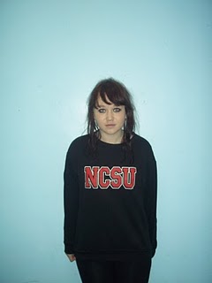
This is Lucy Smith who is 18 years old. Lucy is very experience in acting and is currently completing her second year in drama which means she will have a vast amount of experience and knowledge when it comes to acting. Lucy is aslo very natural and petit looking and will ultimately add diversity to the group.

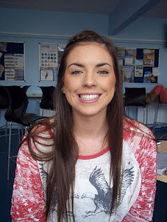
This Eleanor Failes who is 17 years old, which means she is in the relevant age group that we want for our actors. Her look is casual and relaxed, and is something that girls of her age would usually be wearing. Her clothes are not over the top or unrealistic for a teenage girl, which is essential we have in order to make our cast appear realistic and believable to the audience.
Ellie also took drama for GCSE and for AS which means she has a vast amount of experience in acting, which means she will be able to act well and make the trailer seem believable and professional. This also means that she is in a prime spot to be our main character in the film trailer, and as she is also in our close friendship group we can easily contact her for filming.
Ellie also took drama for GCSE and for AS which means she has a vast amount of experience in acting, which means she will be able to act well and make the trailer seem believable and professional. This also means that she is in a prime spot to be our main character in the film trailer, and as she is also in our close friendship group we can easily contact her for filming.

This is Annabelle Roberts who is also in the required age group. Unlike Ellie she has short brown hair in comparisons to Ellie's medium length, blonde hair, which means that her appearance is different therefore adding more of a variety to our group. Annabelle's short hair also means that she could be labelled as more of a "tomboy" ultimately meaning that there will also be a variety of personalities in the group of casts.
 This is Imogen Clapp who is also aged 17, who fits the criteria for our thriller trailer well. Imogen has a quite dark/dramatic look which is needed to add a variety to our actresses. In this picture Imogen is wearing all black clothes, with some red writing, her clothes immediately indicate a gothik side to her which would mean we would have a variety of different stereotypes in the group.
This is another possible cast member, her name is Katie Leask and she is also 17 years old. She has a natural, soft look and wears casual clothes suitable for someone of her age. Katie has a bubbly personality and would play the role of the "sweet" girl well in a trailer and thriller movie. However Katie has no real experience of acting and therefore it would all be new to her, and she may not make the trailer that convincing.
This is Samantha Caunt, who is 17 years old. She has studied drama at GCSE which means she will have experience when it comes to acting in the trailer, which is very beneficial. As well as this Sam is extremely outgoing and bubbly and will be very committed to ensuring that she will be available for filming. 
This is Beth Joyce, who is 18 years old, whp is also in our close friendship group which ultimately means we know we can rely on her and we can easily contact her when needed for our filming. Beth is also very enthusiastic about filming and is excited to hopefully be part of the trailer.
Final magazine cover
Below are our three final magazine cover designs: (left to right; Beth, Ella, Charlotte)


After looking at all three possible magazine covers we have decided that we are going to take forward Beth's magazine cover idea. This is our final choice for our magazine cover:

Magazine front cover ideas
Below are a few of my own possible magazine front covers:

This is my first possible magazine front cover:
- I decided to name this magazine "FILMTIME" i purposely allocated this at the top of the page in bold capital letters to stand out from the page. Here i also decided that the word "FILM" would be in larger writing then the word "TIME", the reason i did this was because i wanted the reader to notice the word film first and instantly realise that this was a film magazine, so it acts and an immediate indicator to the magazine genre. As the background of this cover would be black, i would have the text in white, as it will contrast with the black background and red "68" meaning that it will stand out from the rest of the page.
- The main picture on this magazine front cover consists simply off the title "68" in bold, distorted letters and it is in the effect as if the writing is dripping. Across the middle of the magazine i have put the word "EXCLUSIVE" at an angle across the page, infront of the letter "68". This immediately jumps out of the page and catches the eye of a reader, letting them know that in this magazine there is an exclusive for the new movie. I decided to put this text in capital, bubble writing as it instantly makes the text appear larger and stand out. Other features that i have included on this magazine cover include, "celebrate 100 years of THRILLER"-"Alfred Hitchcock Timeline". For this magazine cover i purposely made sure that all the features related to the featured movie, this was done because i wanted it to be clear that the this was for supernatural fans.
- At the bottom of the magazine cover i have added more text saying "Top Ten Films This Week" this is very common on magazines to show other features which are included in the magazine, and is used as an immediate indicator to attract more buyers and make the magazine more appealing. Having additional features such as this are crucial in a magazine front cover because they are what will draw the reader in and persuade them to buy the magazine.
- At the bottom of the cover i have included a bar code, i did this to make the cover seem more authentic and realistic as almost every magazine cover will have a barcode in the corner used as a way of pricing the magazine. On top of the bar code i have included the price of the magazine.
 This is my second possible magazine front cover:
- For this option i decided to call my magazine "FilmFirst" i decided that i didnt want the font of the text to be overly complicated because i wanted it to appear more sophisticated. I also decided to call this magazine "FilmFirst" because this title is obvious to the readers that the magazine is a film magazine. Underneath the title in smaller text i have put a tagline saying "Essential film news weekly" this also acts as another signifier into the genre of the magazine and also shows the reader that they can rely on it for delivering essential news.
- Apart from the masthead at the top of the magazine cover the majority of the page is taken up by the feature article photogaph, which is a picture of the main girl, infront of a house. The whole background is an establishing shot of the house and the setting is rainy and dark. The shot of the girl is a full body shot and her emotions are lifeless, clearly stating that she is distressed in some way. For the background the colours on this magazine cover will consist of dark, grey colours making the magazine appear gloomy and dark. These dark colours will also acts as an immediate signifier into the genre of the movie.
- I also decided to include a variety of different features in the magazine, as this is a common convention on a magazine front cover. Alongside these common conventions, i also incuded a barcode and price tag to make the magazine appear more realistic.
Monday, 11 October 2010
Title ideas
After thorough discussion as a group we have decided that our final name for our film will be "Darkness Awakens", we have decided to go with this title because it acts as an immediate signifier to the genre of the film, it relates to the story line of the film and it is also catchy and isnt too long or complicated for a film title.
Before this our original ideas for our film title were:
- "68"
- "Tupwood Lane"
- "Paranormal Silence"
- "Paranormal Happenings"
- "Haunting"
Before this our original ideas for our film title were:
- "68"
- "Tupwood Lane"
- "Paranormal Silence"
- "Paranormal Happenings"
- "Haunting"
Final film posters
As a group we have decided that after each member has drawn up 2 possible film poster ideas, we will then each bring all those ideas together and each create a final idea. Then from the three final idea we will decide whose idea we want to take further and develop into our final film poster. Below are the three final posters that as a group we designed: (from left to right; Beth, Charlotte, Ella)


We then came together and looked at all three of our final posters so that we could decide on what one we wanted to use for our final poster. We have decided that we are going to take forward my film poster idea:


We then came together and looked at all three of our final posters so that we could decide on what one we wanted to use for our final poster. We have decided that we are going to take forward my film poster idea:

Film Poster ideas
As a group we have decided that we are going to individually design several of our own film poster and magazine front covers and then bring all of our ideas together and decided whose idea we want to take further and develop into our final poster and magazine cover. It is crucial to know that all names and titles used are just possible ideas and nothing has been finalised at this stage.
Below are my own possible ideas for a film poster:

This is my first potential poster idea:

This is my second film poster idea:
- Unlike the first draft this poster is less busy and the main picture is just of the house, along with the title of the movie which is shown in big bold letters. The whole poster is taken up by an establishing shot of the house, the shot is a night time shot and the house is surrounding by a dark, mysterious wood. The main reason i chose to have this poster at night is because it makes the photo appear more frightening.
- At the top of the poster there are three made up names in a row. I purposely did this to also act as star appeal and attract viewers, but this time i decided to see what it would look like using three names instead of just one. I also decided to have their first names in larger writing on top of the smaller text for their surnames. This was a similar technique i had seen on a previous film poster, which i thought looked good and was different from just putting one name in a line.
- Also at the top of the page i have put a made up review saying "without doubt the best blockbuster of the summer" alongside 5 bold stars. By having a small quote from a review on film poster it will encourage more people to see the film, knowing that it is worth watching.
-At the bottom of the page i have added some text saying "From the producers of Creep and Paranomal Activity" which is another technique to attract the audience by showing similar genre films which have been sucessful, made by the same producers will ultimately attract more viewers.
Below are my own possible ideas for a film poster:

This is my first potential poster idea:
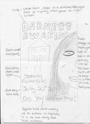
- The poster is taken up by two main objects, which are an establishing shot of a house and a close up shot of part of a girls face. The house is surrounded by a background of woods and a dark night sky making it appear creepy and disturbing. The position of the girls face on the poster gives the illusion that she is far infront of the house, she has a scared, still look in her face staring straight a head clearly looking disturbed and frightened. Having just these two pictures on the poster front cover allows the audience to immediately relate the girls frightened look to the house in the background.
- At the top of the poster in bold, clear writing the name of the main character is shown. This is purposely done to attract audiences by using "star appeal" which ultimately means that having a well known actor/actress that people are familiar with and have enjoyed some of their previous work, will also want to see this film
- Above the main title I have added a short tagline saying "Do you wanna play?", beforehand as a group we decided that this tagline is are final tagline and we will use this for ever poster/magazine front cover. The main purpose of a tagline is to entice the audience and make them question what it means. As well as this it also gives a rough idea into the plot of the movie and acts as a discreet indicator to the films story.
- The title I decided to use for this poster was "68", this is shown towards the bottom of the page in distorted numbers which allow it to stand out from the rest of the page. Below the title I decided to add the release date of the movie, which I wrote in block capital letters to ensure that it stands out from the page as it is extremely important on a film poster, I also decided to write underneath this "dont experience it alone". I purposely did this because it makes the audience question how frightening the film is, therefore resulting in them wanting to see the film and find out for themselves.
-On the poster i also included a small distributor label in the right hand corner, which is used to show the audience who produced the film. As well as this I also included a text line which says "From the producers of "Creep" this is done to show the audience other successful films produced by them in relation to the same genre.

This is my second film poster idea:
- Unlike the first draft this poster is less busy and the main picture is just of the house, along with the title of the movie which is shown in big bold letters. The whole poster is taken up by an establishing shot of the house, the shot is a night time shot and the house is surrounding by a dark, mysterious wood. The main reason i chose to have this poster at night is because it makes the photo appear more frightening.
- At the top of the poster there are three made up names in a row. I purposely did this to also act as star appeal and attract viewers, but this time i decided to see what it would look like using three names instead of just one. I also decided to have their first names in larger writing on top of the smaller text for their surnames. This was a similar technique i had seen on a previous film poster, which i thought looked good and was different from just putting one name in a line.
- Also at the top of the page i have put a made up review saying "without doubt the best blockbuster of the summer" alongside 5 bold stars. By having a small quote from a review on film poster it will encourage more people to see the film, knowing that it is worth watching.
-At the bottom of the page i have added some text saying "From the producers of Creep and Paranomal Activity" which is another technique to attract the audience by showing similar genre films which have been sucessful, made by the same producers will ultimately attract more viewers.
Thursday, 7 October 2010
Shot list one
1. distributor label
2. car driving down road, pan shot.
3. text: "starring Eleanor Failes"
4. girls driving inside of car in the style of found footage. Dialogue between the girls in the style of found footage
5. car pulling into drive showing an establishing shot of the house
6. girls walking into house, dialogue between two characters about stories of the house
7. text appears "lets play a game..."
8. birds eye shot of glasses being held up, as they bring glasses down, ouija board from underneath is revealed
9. start playing ouija board and one girl becomes possessed, everyone begins to panick
10. girl who was "possessed" burst out laughing, others get angry and throws board to the floor
11. phone rings, close up of phone and panick looks on the girls faces
12. text appears "...if your brave enough"
13. one girl answers phone but all she can hear is white noise
14. abruptly slams phone downs
15. girls all look at each other scared
16. lights turn off and everyone screams, 2 second silence flashing shots begin
17. one girl running upstairs, looking frightened and screaming
18. one girl grabs knife from kitchen in a panicked flush
19. door slams, panicked girls trys to open door. dialogue from girl
20. girl running through woods, heavy breathing
21. point of view camera shot chasing screaming girl
22. girl falls down
23. found footage towards screaming girls face, dialogue from girl
24. abrupt silence, title appears "darkness awakens"
25. text appears: "do you wanna play?"
26. release date "20th July"
Shot list two:
1. Producer label flashes up
2. Shot of car coming up the road
3. Text -"Starring Eleanor Failes"
4. In car - in the style of found footage, Dialogue between the girls about the holiday as they pull into the driveway
5. Establishing shot of house
6. Girls walking into house dialogue between two girls about the house
7. Text "Lets play a game
8. Shot of girls pouring drinks(Ouija board visible next to the glasses)
9. start Ouija board - one girl pretends to see something out the window
10. girl shows she joking - other girls gets angry and throws board on floor - dialogue
11. Door slams- girls look shocked
12. Text- "if your brave enough"
13. Girl go to investigate
14. door slams again
15. girls all look at each other
16. lights flicker of girls scream - 2 second silence
17. Flashing shot of girl running down stairs looking frightened
18. Girl grabbing knife (flustered)
19. girl being pulled from under bed
20. Girl running through woods away from us
21. In the style of point of view- girl running through woods
22. Girls enclosed into a corner by the 'spirit'
23. In the style of point of view- close up of her face as she screams "what are you?"
24. Text- Title appears
25. Text- "do you wanna play" - tag line appears
26. Text -Date release
Planning of trailer
As we have now moved on to the stage of planning our trailer, as a group we have started by creating a basic spider diagram of our initial ideas for our trailer to make it clear and obvious what our ideas are and how we are going to stem from them:


We then followed this by writing up our own synopsis of our trailer, this is a basic outline of the stages of our film trailer which will make it easier for the viewer to follow our trailer. We decided to base our synopsis by following Todorovs theory of five simple stages, which consist of;
1. A state of equilbrium
2. A disruption of that order by an event
3. A recognition that the disorder has occured
4. An attempt to the repair the damage of the disruption
5. A return or restoration of a new equilibrium

Subscribe to:
Comments (Atom)