
I then began the creation of the film poster which began by: 1. I began by editing the photo of Ellie by removing all of the background so that i was left with just Ellie's face. I achieved this by using the magic wand tool.

2. My next step was to edit the picture of Ellie. I firstly began by adding an inner glow to the picture and then changing the brightness and contrast of the picture. I decided to lower the brightness to -33 and making the contrast higher to 49.
3. I then changed the colour of Ellie's face to a vibrant red colour. We found it very difficult to decide on what colour we wanted to make Ellie, but eventually decided that a blood colour red would be most effective 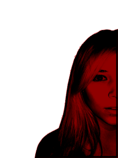
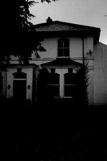
4. The next step was to edit the picture of the house. This was done by Beth who changed the colour scheme to black and white and the made the contrast level high, and lowered the brightness level.
5. The next step was to put the photo of Ellie ontop of the house picture to begin putting together the film poster.
6. After this I then put in the text for the main title "Darkness Awakens". We decided to use this text from the website dafont.com. Originally this text was black but we decided to change it to white so that it would stand out well from the black background.
7. I then put the "stars names" at the top of the poster. This took some time in deciding what font we wanted to use because it was hard to find one which worked well. I also decided to have the last name in bigger text then the first and also have them in different colours and fonts.
8. I then completed the poster by adding a billing block and our logo at the bottom.

No comments:
Post a Comment