After looking at our trailer again we decided to make a few changes, this included moving a few shots around, adding a slow motion shot and changing the lighting.
http://www.youtube.com/watch?v=O9JV3AgczJk]
Thursday, 5 May 2011
Tuesday, 15 March 2011
How did you use media technologies in the construction and research, planning and evaluation stages?
I used a wide variety of different media technologies throughout my coursework which helped aid my research, planning, construction and evaluation of my project. However the main media technology that I used throughout my development of my coursework was BLOGGER. Blogger allowed me to keep a detailed journal of the different stages of my project, from research and planning, to the production and evaluating. It enabled me to store my work efficiently and was easy to access throughout the duration of my coursework. As well as this it also allowed me too upload images and videos which related to my work.

We also used these two programs for the designing of our logo, we were able to use the images already provided on the software and play along with different pictures and texts.

Research:
The main form of media technology used for the research stages of our coursework was GOOGLE. 
 Youtube allowed us to search different trailers for films which fell into the category of supernatural thrillers, such as Paranormal Activity and The Shining. Youtube played a vital role in the research stages of our trailer because it gave us the opportunity to analyse in depth real media trailers and see what conventions were used when it came to things such as; lighting, music, camera shots and angles. It was also very time saving and efficient to use, and it also meant that I could copy the URL link and post it on to my blog.
Using Google allowed me to thoroughly research different genres and the conventions of supernatural thrillers, as well as this it also allowed me to research other existing supernatural thriller films.
Using the browser steered me towards many useful websites which helped towards my research stages of my coursework. One of the most useful website that Google lead me too was http://www.filmsite.org/ Filmsite is a online website which has been operated by Tim Dirks since 1996 and offers information concerning; Greatest Films, Oscars, Quotes, Genres, Scenes, History, Reviews etc. 
This website was extremely useful for us when it came to genre research and it had a huge variety of information concerning different genres and conventions of genres. This website was ultimately responsible for our final choice of Supernatural Thriller.
As well as this, YOUTUBE also played a vital role in helping us research other thriller trailers and allowed us to see what forms and conventions were used in them.
Youtube allowed us to search different trailers for films which fell into the category of supernatural thrillers, such as Paranormal Activity and The Shining. Youtube played a vital role in the research stages of our trailer because it gave us the opportunity to analyse in depth real media trailers and see what conventions were used when it came to things such as; lighting, music, camera shots and angles. It was also very time saving and efficient to use, and it also meant that I could copy the URL link and post it on to my blog. Planning:
When it came to planning the dates for our filming and arranging a time and place we decided to use the social networking site FACEBOOK to send out an email to all of the people involved as well as this we also sent out group texts from our mobile phones confirming of dates. When it came to the planning of our film poster and magazine cover using media tec hnologies was limited as most of our planning was achieved on print. This is because we drew several copies of potential posters and magazine covers by hand. However, in order to get the image onto Blogger we used an image scanner. This is a device which optically scans images and printed texts and converts them into a digital image. We also used this technology device to upload the images of our story board for our trailer which had originally been designed by hand.
 hnologies was limited as most of our planning was achieved on print. This is because we drew several copies of potential posters and magazine covers by hand. However, in order to get the image onto Blogger we used an image scanner. This is a device which optically scans images and printed texts and converts them into a digital image. We also used this technology device to upload the images of our story board for our trailer which had originally been designed by hand.
 For the planning of the film poster i decided to make a template version on the software package ADOBE INDESIGN. This allowed me to have a rough idea of how the final poster was going to look on a computer and showed me what worked well and what didnt. It gave me the opportunity to play around with different colours, backgrounds and positioning of different texts.

We also used PAINT and MICROSOFT WORD to help us decide what font we wanted to use for our main title "Darkness Awakens". In order to achieve this we used the popular website DAFONT, to look at different possible fonts that could be suitable  for our poster, trailer and magazine cover. We then print screened the shot from the website, pasted them onto paint, which allowed us to crop the font that we wanted and then finished by pasting all of the possible options onto Word. This allowed us to compare the different fonts and come to a decision on want font we wanted to use.
 for our poster, trailer and magazine cover. We then print screened the shot from the website, pasted them onto paint, which allowed us to crop the font that we wanted and then finished by pasting all of the possible options onto Word. This allowed us to compare the different fonts and come to a decision on want font we wanted to use.
 When it came to the planning for our trailer, one of the media technologies that we use d was a KODAK CAMERA. We used this device to take pictures of our potential cast members and also to record the auditions that we had taken. This was quick and efficient and allowed us to easily upload the images onto blogger. This was also the same camera that we used to take the images for the magazine front cover and the film poster.
 d was a KODAK CAMERA. We used this device to take pictures of our potential cast members and also to record the auditions that we had taken. This was quick and efficient and allowed us to easily upload the images onto blogger. This was also the same camera that we used to take the images for the magazine front cover and the film poster.
 Construction:
Media technologies were used most when it came to the construction of my coursework and they played a vital role in the development of the trailer, cover and poster.
To create the magazine front cover and poster we used a combination of different softwares which allowed us to edit the photos and put the whole product together. To edit the picture for the film poster i began by using MACROMEDIA FIREWORKS MX.
I used this software to edit the pictures of the house and the face and i aslo used it to put together all of the aspects of the poster. This was very useful in the construction of our ancillary task as it enabled us to add different effects to the images such as changing the colours and contrasts. I also decided to use this software because i found it easier to work with which meant i could be efficient and achieve the best results possible.
When it came to the magazine front cover, Charlotte decided to use INDESIGN instead. This has similar features to Fireworks but as Charlotte had used this program before she felt more comfortable and knew how the tools worked.
We filmed our footage for the trailer using a DV CAMCORDER with digital video tapes. How to use the camcorder was easy to pick up and we were able to use special effects on the camera such as night vision and zooms. We then uploaded the footage from the camera onto the program MOVIE PLUS 5, as this is the software that we used for the construction of the trailer. Although none of us had used this software before it was very easy to pick up and eventually we were able to get the hang of it, adding special effects such as slow motions, adding different transitions such as flashes and fades, adding text and images and also changing the volume for some of the shots.
Evaluation:
In order to achieve adequate feedback for the evaluation of our coursework we  felt the best way was to post our poster, trailer and magazine front cover on FACEBOOK. We chose to use this social networking site because it is extremely popular with our target audience of 15+ and we are also extremely aware of how the site operates, which means we were able to upload the pictures and videos without any hold backs.

We also uploaded the trailer onto YOUTUBE, we decided to do this because it is used widely by millions of people and therefore we can gather a larger range of audience feedback.
BLOGGER has also been extremely useful when its come to evaluating all of our coursework. This is because it has given us the opportunity to keep a detailed analysis throughout and also talk about what went well, what didnt and what could be improved.
What have you learned from your audience feedback?
Audience feedback is something which plays a vital role in the development of any media product. This is why I was determind to take all feedback as constructive criticism and use it to help improve our poster, magazine and trailer, to achieve the best result possible. Throughout the production of our coursework, we constantly had feedback from members of our class and also our media teachers, who were able to give us appropriate feedback as to how we could develop and improve. In order for us to achieve our audience feedback for our final images, we decided firstly to put our film poster and magazine front cover as an image onto "Facebook". The reason my group decided to do this was because we know that Facebook is extremely popular among our target audience and this would give us the opportunity to get appropriate feedback. Magazine Front Cover: 
 This the feed back that we recieved for our magazine front cover, after posting the image onto facebook.


The main feedback we recieved for our trailer was concerning the music at the start.
This the feed back that we recieved for our magazine front cover, after posting the image onto facebook. - Most of the feedback was extremely positive and people particularly liked the way we had placed the text "Back" backwards, comparing it to a "visual homophone".
- As well as this they also liked the way we kept the colour scheme throughout, with the reds/blacks and whites as this kept a theme running and also relates back to the film it is promoting.
- However, some feedback said that the tagline "do you wanna play?" could be slightly bigger so that it was more noticable to buyer.
In order for us to get an even greater insight as to how we could improve our magazine front cover we decided to ask the opinion of our class peers as they are more aware of the conventions and forms of a film magazine cover should have.
- The main feedback that we recieved was the fact that the border was not even, making it seem less professional. As well as this people also said that the pictures at the bottom did not follow the colour scheme and the tagline needs to be more noticable and obvious.
Film poster:
- Above is some of the feedback that we recieved on Facebook when it came to the film poster, the majority of people said that they liked the red colour however there was some debate as to whether Ellie should be in red or not. This is because some people said that maybe she should be in a green scale so that it made it seem as if it was in night vision mode but as a group and class we decided that the red kept the theme continuous so we wanted to keep it.
- One of the main positives about our poster was the different fonts that we used, as they were clear and related to the genre of the film.
- It was pointed out that may be the names at the top should be one colour rather than two. The reason we decided to make the last name a different colour and size was because we wanted them to stand out more than the first names.
Film trailer:
We also decided to put our film trailer onto facebook as well and ask for as much feedback as possible. We were able to gather a large amount of feedback from this:
The main feedback we recieved for our trailer was concerning the music at the start.
- A few people said that the music was too loud at the beginning, this made it difficult for the dialogue between Ellie and Lucy to be heard and also acted as a bit of a give away to the rest of the trailer. We agreed as a group that this was a problem so we decided to lower the volume of the music at this point.
- People also agreed that the shots ran well and the continuity flowed, as well as this they liked the way the shots were longer at the beginning and then as the pace built up the shots became faster and shorter.
- Feedback from facebook and class members also agreed that they liked the part were the Lucy pretends to be possessed. This is because they liked the way it builds a sense of faulse tension. This was the purpose of this scene, so we were happy that we were able to achieve this.
- After our class members and media teachers viewed our trailer they all agreed that the shots need to be more varied and disjointed, this is because a trailer are not usually shown in chronological order. In order to resolve this we decided to move the shot of the glasses in between the dialogue scene
How effective is the combination of your main product and ancillary texts?
I feel that the combination of our main product and ancilliary text have all worked well together in order to create a successful advertising campaign in an attempt to attract as many people as possible.
In order to clearly link our 3 products together (trailer-magazine front cover-film poster) it was crucial that we kept certain things the same. For example, we kept the colour theme throughout the products the same, this included red/blacks and whites. The reason we chose these colours is because they act as a signifier to death, blood, evil etc. all which are related to the genre of our products. This means that the colours act as an imediate indicator as to what the audience should expect when they go to see the film.
As well as this we decided to keep the font for "Darkess Awakens" the same for every product, at the end of the trailer, and on the magazine front cover and poster. The reason we did this is because we wanted a font that could be easily recognisable and linked from each product. This is also the reason why we included the same tagline "do you wanna play?" on all three products. The purpose of this tagline is to act as a clue into what the film is about. It is alot easier to relate the tagline to the trailer as the audience can clearly see that the tagline is a reference to the girls playing a ouija board, this is less obvious in the poster and magazine cover.
Throughout our media product we have always maintained the fact that Ellie is our main character in the trailer. This is why we used her face on the magazine front cover and the film poster. In order to ensure audiences could link the three products together, we made sure that Ellie was wearing the same clothes throughout and kept the same hair style and level of makeup.
On the film poster, we also used a picture of a house in the background. We made sure that the picture of the house was the same house that we used in the trailer. This ensured that our products linked and were relateble to one another.
In what ways does your media product use, develop or challenge forms and conventions of real media products?
Throughout our media production we have not only used a number of forms and conventions that real media products use, but we have also tried to challenge and develop them. Before we could begin the planning and developing of our trailer it was crucial that we did a vast amount of research into thrillers and supernatural thrillers so that we were completely aware of the forms and conventions of this genre. This meant researching conventions such as; lighting, sound, camera shots, camera angles, costumes and casts. Almost all of the trailers that we analysed during our research used a certain type of music. For example the music began calm and mellow before breaking into fast paced, high energy movement. This technique builds tension and helps build towards a final climax. 
 The two shots emphasise the dark/grey colours that are used in paranormal thrillers in order to create a sense of danger and evoke fear into the audience. One of the most obvious forms and conventions that we used in our trailer was conforming to the Longacre's theory and using these stages to develop our own trailer. However, Longacre's theory is specifically designed to help define the stages of a film, but as we were only using it for a trailer it meant that we had to alter it slightly by only using the first few stages rather than all 8 of them. We incorporated several of the stages into our trailer such as the aperture, exposition, inciting moment, developing conflict and the denouement. This theory is used in several real media products such as "The Shining" and "Paranormal Activity" and we wanted to mimic this in our trailer. This is why we began our trailer with the "once upon a time" opening where the group of girls are excited and preparing for their holiday, this is a common technique and we used it so that the audience would be unaware of the events about to occur.
 Above is a screen shot taken from the trailer of "The Shining", here the colours are bright, the establishing shot is attractive and the setting appears completely innocent.
 Another formal convention that we wanted to include in our trailer was the use of "found footage". This style has only recently become more popular due to films such as "The Blair Witch Project", "Clover Field" and "Paranormal Activity" and is based on the narrative premise that the characters in the film are real people who have been shooting the footage themselves. This changes the way the audience reacts to the film as potentially they see the protagonist's as real people like them, which should ultimately make it more frightening for themselves as it is easier for them to relate to the characters.
 listic poster we posibly could.

The screen shot of our music above emphasises the different levels of pitch used throughout our trailer. It is obvious to see that towards the end of the trailer, when the shots become fast and tense, the music is significantly louder and faster.
Another convention of a supernatural thriller movie is the use of dark sombre colours. We needed the colours to be dark in order to create an atmosphere. Below are two screen shots, one taken from the trailer for Paranormal Activity and the other from our trailer.
The two shots emphasise the dark/grey colours that are used in paranormal thrillers in order to create a sense of danger and evoke fear into the audience. One of the most obvious forms and conventions that we used in our trailer was conforming to the Longacre's theory and using these stages to develop our own trailer. However, Longacre's theory is specifically designed to help define the stages of a film, but as we were only using it for a trailer it meant that we had to alter it slightly by only using the first few stages rather than all 8 of them. We incorporated several of the stages into our trailer such as the aperture, exposition, inciting moment, developing conflict and the denouement. This theory is used in several real media products such as "The Shining" and "Paranormal Activity" and we wanted to mimic this in our trailer. This is why we began our trailer with the "once upon a time" opening where the group of girls are excited and preparing for their holiday, this is a common technique and we used it so that the audience would be unaware of the events about to occur.This is used in almost all trailers but one in particular that I had used in my research is the psychological thriller "The Shining" (1980 Stanley Kubrick) were a couple and their young son are planning to stay in a hotel. The trailer begins by creating a completely different atmosphere; the lighting is bright, the music is mellow and the story line at this point is completely innocent, and this is what we wanted to achieve in our trailer.
Above is a screen shot taken from the trailer of "The Shining", here the colours are bright, the establishing shot is attractive and the setting appears completely innocent.Giving the illusion that all is calm and well also links to Tristan Todorovs theory that most narratives start with a state of equilibrium in which life is normal and protagonist happy. This convention is used in the film trailer of "Shrooms". Although the film Shrooms does not fall directly into the category of the supernatural thriller genre it does have a similar story line to our trailer, in the fact that a group of young teenage friends are going on holiday together. At the beginning of this trailer the friends are excited and looking forward to their holiday, which is the same technique we used at the for the opening of our trailer.
 Another formal convention that we wanted to include in our trailer was the use of "found footage". This style has only recently become more popular due to films such as "The Blair Witch Project", "Clover Field" and "Paranormal Activity" and is based on the narrative premise that the characters in the film are real people who have been shooting the footage themselves. This changes the way the audience reacts to the film as potentially they see the protagonist's as real people like them, which should ultimately make it more frightening for themselves as it is easier for them to relate to the characters.
We decided that as a group we wanted to go against the norms when it came to the decision of the cast members. Propp's theory is that it is possible to define characters and actions into clearly defined roles and functions, however this is not obvious in our trailer. We decided not to make this obvious because we wanted to leave a sense of mystery to our trailer and this is also the reason why we didnt show the villains identity. This concept is of not showing the killers identity is used in the trailer of thriller film "Prom Night" and we wanted to mimick this in ours as the fear of the unknown can evoke a real sense off panick for the audience and also leave them intrigued and aching to find out who the "killer" is.
When deciding who we wanted to use for our cast we also decided that we wanted to conform to the theory of feminism, this is why we decided to keep all of our cast females. This is similar to the film "Sorority Row" where the main characters are young female girls. 
 listic poster we posibly could.
We decided to use the film poster for "Dead End" as an example for our own poster. The main aspect from this that we wanted to take was the colour scheme of red/black and white. This is the scheme that we decided to use throughout all of our tasks.
Release Date: we included our release date at the bottom of the poster along with the line "Coming Soon". This is also used in the film poster for Paranormal Activity.
Block buster draws: commonly the stars names are shown ast the top of the film poster, this is to attract more viewers and draw them in to the film. This is also used in the film poster for Dead End.
Billing block: this is shown at the bottom of the film poster and contains information such as production team, people involved and actors names. This is used in the film poster for The Box
Tagline: We also wanted to include a tagline for our poster that would be recognisable, catchy and also relate to the film. Examples of taglines from real media projects include "Because someone is dead, doesnt mean they're gone"-Gothika or "Oh yes...there will be blood"-Saw
We also decided to keep to the same theme when it came to the magazine front cover by keeping to the conventions of a film magazine front cover. The reason for this is because once again we wanted to ensure that the cover was as realistic as we could make it, and in order to achieve this it was crucial that we followed the forms and conventions of a real magazine front cover.
We wanted to ensure that our magazine title was bold and stood out from the page in order for it to be immediately eye catching. This is why, like the real film magazine "EMPIRE" we kept all of our letters in block capitals, we also wanted our name to relate to the genre of the magazine.
As well as this other aspects that we have used in our magazine front cover that mirror real media products are factors such as; a barcode, a reasonable price tag, a website adress and special features included. We also included exclusive story lines and interviews, these act as a feature in order to entice readers to buy the magazine ultimately attracting more buyers. As this is a film magazine all of our special features are related to the film genre, this maintains a theme and also conforms to the forms and conventions of a real film magazine.
We kept the colour scheme by using monotonous, dark colours which were also used in the film poster. Not only does this relate to the genre of the film but also links the media products together, which is essential for a successful marketing campaign.
Saturday, 5 March 2011
Changed magazine front cover
After we had our media class look out each piece of our production we were able to gather useful advice on how we could improve our magazine front cover more. This is now our final magazine front cover with the changed we had made: 
- The first thing we changed was adjusting the border around the edge and making sure that the sides were even
- We changed the order of the pictures below, this is because we wanted the colours of the pictures to work well with the colours of the main image
- We moved the tagline to the right of the title, this is so that it stands out more on the black background and relates to the film more
- The last change we made was making the text "FILM AWARDS-HIGHLIGHTS" into a white colour and the "2010" into a red colour.
Friday, 4 March 2011

Magazine front cover images

These were the images that Beth had originally taken, however after we had thoroughly looked at them and tried one on the magazine cover, we realised that these images are not best suited to our cover. The main reasons why we decided that these pictures were not suitable for our magazine front cover was because the lighting was to bright and the image isnt big enough for the cover, and this would mean that we would have to stretch the photo and therefore making it appear distorted.

Above are the new pictures that Beth had taken and these were much more suitable for the magazine cover. This is because the lighting is well done, and highlights Ellie's face emphasising her emotion.

Above are the photo's that Beth has edited for the magazine front cover. To edit them Beth changed the contrast brightness and colour tones, this made the pictures appear more dramatic and made Ellie stand out from the page.
Poster Process
CREATIVE PROCESS-

ORIGINAL DRAFT- this is our orignal draft that we chose to base our film poster on

PROFESSIONAL INFLUENCE- this is a professional poster that we also based our film poster on. We decided to take the colour scheme and use the red/black and white colours.

OUTCOME- this is our final film poster. From the original draft we kept the basic outline of the half the face at the front and the house in the background. From the professional film poster we made the colour scheme similar.

Thursday, 3 March 2011
Editing Poster
Now that we had the pictures taken that we needed for the film poster I was able to begin with the construction of the poster. As a group we decided that as well as using the template that we had originally drawn, we were also going to use the same concept that the film "Dead End" had used for there film poster. This meant using black and red images, which signfy horror, blood and evil, which is ultimately suitable for the theme of our trailer. I origanally created my template on Adobe Indesign but decided that i was going to create the actual poster on the software, Fireworks MX.


I then began the creation of the film poster which began by: 1. I began by editing the photo of Ellie by removing all of the background so that i was left with just Ellie's face. I achieved this by using the magic wand tool.
2. My next step was to edit the picture of Ellie. I firstly began by adding an inner glow to the picture and then changing the brightness and contrast of the picture. I decided to lower the brightness to -33 and making the contrast higher to 49.
3. I then changed the colour of Ellie's face to a vibrant red colour. We found it very difficult to decide on what colour we wanted to make Ellie, but eventually decided that a blood colour red would be most effective 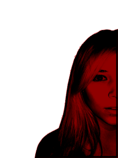
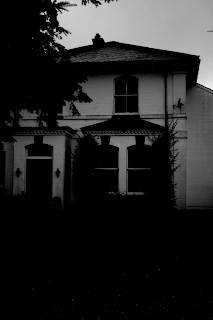
4. The next step was to edit the picture of the house. This was done by Beth who changed the colour scheme to black and white and the made the contrast level high, and lowered the brightness level.
5. The next step was to put the photo of Ellie ontop of the house picture to begin putting together the film poster.
6. After this I then put in the text for the main title "Darkness Awakens". We decided to use this text from the website dafont.com. Originally this text was black but we decided to change it to white so that it would stand out well from the black background.
7. I then put the "stars names" at the top of the poster. This took some time in deciding what font we wanted to use because it was hard to find one which worked well. I also decided to have the last name in bigger text then the first and also have them in different colours and fonts.
8. I then completed the poster by adding a billing block and our logo at the bottom.

Thursday, 17 February 2011
Film Poster Pictures
Beth was in charge of taking the pictures for the poster, which included the photos of Ellie and also a picture of her house. Below are several off the unedited pictures that we may be using for our film poster:

It was Beth's job to take several different shots of Ellie for our film poster, the basic idea for this picture was to take a shot of Ellie looking straight at the camera with a startled/ wide-eyed expression. However we dont want to have the whole of Ellie's face in the picture, only around 60% of the face.
We now need to look at each picture thoroughly and take into consideration which one will work best for our film poster. Certain aspects that we need to consider are; the lighting, the expression, the size and how easily we can fit it into our poster.

Above is the image of Ellie that we have decided to use for our film poster, we went for this one because the lighting in the photo was the best and highlighted Ellie's startled look well. It was also the best size for the poster because it showed the right amount of Ellie and still allows for her emotion to be portrayed.
Aswell as the image of Ellie's face we also needed a picture of Beth's house for the background of the poster. We needed to ensure that the the picture was taken at the correct time of day, this is because we wanted the sky to look gloomy and dark but we couldnt leave it too late as otherwise when we came to editing the picture it would look to dark and blurry to see.
This is the picture of Beths house which we are going to use for our film poster:


It was Beth's job to take several different shots of Ellie for our film poster, the basic idea for this picture was to take a shot of Ellie looking straight at the camera with a startled/ wide-eyed expression. However we dont want to have the whole of Ellie's face in the picture, only around 60% of the face.
We now need to look at each picture thoroughly and take into consideration which one will work best for our film poster. Certain aspects that we need to consider are; the lighting, the expression, the size and how easily we can fit it into our poster.
Above is the image of Ellie that we have decided to use for our film poster, we went for this one because the lighting in the photo was the best and highlighted Ellie's startled look well. It was also the best size for the poster because it showed the right amount of Ellie and still allows for her emotion to be portrayed.
Aswell as the image of Ellie's face we also needed a picture of Beth's house for the background of the poster. We needed to ensure that the the picture was taken at the correct time of day, this is because we wanted the sky to look gloomy and dark but we couldnt leave it too late as otherwise when we came to editing the picture it would look to dark and blurry to see.
This is the picture of Beths house which we are going to use for our film poster:
Wednesday, 16 February 2011
Font changes
After trying out the several fonts that we had initially chosen, we decided that some of them did not work as well as we had hoped and therefore it was necessary to change them.
- Playback- Magazine front cover name will be in font - Franchise.
- Darkness Awakens- Title of the film on the magazine front cover, film poster and movie trailer will be in font- ACID LABEL of Dafont.
- Film awards 2010 highlights- writing on magazine front cover will be in font- impact
- Exclusive interview- writing on magazine front cover will be in font- Copper STD
- Issue 217-writing on magazine front cover will be in font-200 Century gothic
- Trailer writing (Eleanor Failes/ release date)- will be in font Tosca Zero
- Behind the scenes- magazine front cover- impact
Wednesday, 9 February 2011
Film Poster Planning
I originally began designing the film poster for darkness awakens on the computer package Adobe Indesign. At this point in time the pictures that we will be using for the poster are unavailable so I decided to start by making a simple template on the computer using our original ideas. I began by opening a blank document in Indesign and filling it with a black background, this is because for our poster we wanted to keep the colours dark and monotonous and having a temporary black background will give me a rough idea of whether the other colours in the font work well.
I then added in the text that we have decided to use for our poster and positioned them where they are going to be in the final poster. The font I used at this stage is not the font that we are going to use in the final poster it is solely there to give us an idea of what the poster will look like and how big or small the font should be, and also where we should position the text in the poster.
I decided to write the stars names “Eleanor Failes” and “Lucy Smith” in red writing and position it at the top of the page, in order to make it look more effective I decided to make the first names of the stars bigger then their last names which I positioned underneath of the first name. The reason I did this is because it is a conventional aspect of a film poster to have the stars name at the top of the poster, this is because it is purposely there to attract more people with the star appeal of the film.

I also decided to put the "IN CINEMAS JULY 20TH" in bold red font at the bottom of the page. Even though this poster is only a template for our actual film poster, we all felt as a group that we liked the positioning and font of this line and therefore we are going to use it in our final design.

I then went on to try and find the best positioning for the title of the film and also where to position the line for the review of the film. I decided to write these fonts in a white colour because i wanted it to stand out from the black background and from the red font that i used for the other pieces of texts.
The font i used for the title of the film "darkness awakens" is not the actual font that we will be using from dafont.com, it is simply there to give me a rough idea of the positioning of the text and the size of it.
For the review line "The best thriller of the summer", i decided to copy star shapes from Microsoft Word and position five stars below the line.

This is what my final template looked like when I had finished positioning the texts and sizes of them. This template will give our group a rough idea of how the final poster will look, however we may change certain parts of the poster if they do not work well with the images:

Saturday, 5 February 2011
Thursday, 20 January 2011
Editing
When it came to editing the footage that we had filmed from the previous day, we decided that we would take turns using the system MovieMaker5 when it came to putting together our trailer. Taking turns also meant that it would give us all a chance in learning the system and having an input in making the trailer.
Below is a screen shot of the software MovieMaker5:

The software was extremely easy to get used to and we were able to pick it up reasonably quickly. It allows you to piece together the different shots and add in different shot transitions such as fades, cuts and wipes.
Below is a screen shot taking from MovieMaker, as you can see there are different effects, transitions, text edit and colour edits.
![]()
After we had uploaded all of the footage that we had filmed the previous day, it was a pretty lengthy processing putting all of the shots together, because we had to make sure that the shots flowed well and the continuity was correct. We then had to add in effects such as fades and flashes and also edit any shots which needed more adjustment.
For example, the screenshot below is the shot of the car driving along, however there was some talking in the back ground and we felt that the sound of the car was too loud, so we had to bring down the level of noise.

For the screen shot below of Lucy in the bathroom, we felt that the lighting was too bright so we decided to lower the lighting to make the atmosphere more suitable for the trailer.

Filming
On the 7th December after school at 3:30 we all met at Leazes Avenue, which is where we filmed the first part of our trailer, with the pan shot of the car driving down the road. We decided to chose this part to film the car shot because it is quiet road where we were able to film the car shot several times without being disturbed by other cars driving down the road. It also allowed Sam (who was driving the car) to drive particularly careful due to the icy conditions.
Filming this shot was particularly easy however we did face a few difficulties, for example we had to re-shoot it several times as we found it particularly hard to move the camera on the tripod smoothly without jolting.
Once we had finished filming the car driving down the road and the girls inside the car, we left Leazes Avenue and moved on to Caterham Valley where the house we are filming in is located. We began by filming the shot of the car entering the house, this shot is acting as the establishing shot of the house, so it was very important that we got it right and made the house appear frightening and isolated. As Charlotte positioned the camera into place, Beth and myself informed the girls on what to do, this included how fast to drive up the driveway, where to park the car and when to begin moving.
We then followed this by taking the long shot of the girls leaving the car and then the conversation between Ellie and Lucy before entering the house. First off all we filmed all four of the girls leaving the car, and made sure that Beth and Sam walked into the house whilst Ellie and Lucy remained by the car. We then ended this shot and followed it with the conversation shots. In order to get the continuity correct we had to break down this shot into three parts. We achieved this by filming a close up shot of Ellie speaking her line, stopped the camera filming, then proceded by moving and filming a close up of Lucy speaking her line. We the stopped filming once again, moved the camera back into its original position of the long shot and filmed the two girls walking into the house. This shot was more difficult then the other shots because we had to ensure that the continuity of the shots worked well and it looked as if the three shots flowed well.
The next shot was located inside the house in the living room where we filmed the ouija board scene. Before we could begin filming the scene it was important that we first off all made sure that the room looked correct for the particular scene that we were shooting for. This meant completely clearing the table where the ouija board would be set and moving back the furniture to allow enough room for all four girls to sit around comfortably. We also needed to include a few props in the shot which included, the fake ouija board that we had made, the bottles of alcohol on the table to make it seem as if the girls had been drinking and four shot glasses which we filled with water to give the illusion of alcohol.
We then began filming the ouija board scene, the first shot that this involved was a crane shot over the top of the girls as they drank the drink in the shot glasses. This particular shot was slightly difficult because we had to hold the camera over the top of the girls, keeping a steady hand whilst filiming the shot glasses coming down and we also had to make sure that the girls brought down their hands at the same time, this is why it took us several takes to get the shot perfect but eventually we were able to do this.
The next scene that we filmed was the girls beginning to play the ouija board. We had to break down this shot into several parts, we began by simply filming th girls pretending the play the ouija board, we then moved onto a close up of Lucy pretending to be possessed by the board. We decided that we would film Lucy becoming possessed in one shot and then when it came to editing we could cut them shorter and place shots of the girls reactions in between them. This meant that we then had to take medium shots of the girls reactions, we began by first taking a shot of Sam and Beth together, then changed positions and took a shot of Ellie's reaction. We told the girls that we wanted them to look frightened and begin edging away from Lucy, we also asked Ellie to add some dialogue into her scene which involved her calling out Lucy's name.
After we had finished filming the other girls reactions we moved the camera back to position we had before when we were filming Lucy being posessed and took the shot of Lucy laughing and telling the others that she was only joking. This was then followed by movie the camera and taking a first shot of Sam and Beth laughing together. Taking this shot proved difficult as the girls found it hard to fake laugh, which meant it took several takes untill we could get a shot worth using in the trailer. The next thing we went on to film was Ellies reaction, which was her being angry and throwing the ouija board off the table. To get the angle right on this shot we had to move to behind where Lucy was sitting and then film Ellie's reaction.
Once we had finished with the ouija board scene we had to continue and take the shot of the phone ringing. As the phone the we are using for the scene is not an actual working phone we had to create the illusion that it does work. We achieved this by finding a ring tone on one of our phones which was just a basic ringing noise and then once we were ready to film the shot we pressed the button on the phone, which made it seem as if the phone was ringing.
The next point in the trailer is the point were the "developing conflict" begins, when the action begins to intensify. For these shots we wanted to firstly begin by taking a shot of Beth running up the stairs as if she was being chased. We achieved this shot by standing at the bottom of the stairs with the camera and panning the camera round as we followed Beth running up the stairs. The next fast shot that we needed was a shot of Sam firstly running into the kitchen, grabbing a knife from a draw and then backing up. In order to achieve this shot successfully we had to split it into three parts, this meant beginning by taking a shot from outsife of the kitchen of sam running into the kitchen. We then had to move and take a close up shot of Sam rumaging through the draw to find the knife, stop filming and then take a shot of her holding the knife and backing up whilst looking frightened.
Once we had finished these two shots, we needed to take the shot of Lucy in the bathroom. We found this shot particularly difficult because it was hard to get the camera in the right position as the bathroom was quite small, it was also difficult trying to get the lighting right and make it look as if the door was being slammed shut. In order to try and get this shot we had the idea to try and have Lucy pushing the door, but making it look as if she was trying to prevent it from being shut. We then had her banging on the door shouting for someone to let her out.
The final shot was of Ellie running in the woods. To get this shot to look its most effective we changed the camera mode to "night time filming" and then wanted to make the camera look as if it was the person chasing the girl. We did have a view difficulties with this shot due to the fact that it was icy, this meant that running was particularly difficult because it was very slipperly and we didnt want anyone to get injured. We then ended the final shot with Ellie falling to the ground and screaming towards the camera.
Filming preparation
As we have now completed our planning stage of our trailer, film poster and magazine front cover, it was time for us to begin filming for our trailer. Before we could begin, we needed to arrange a date and ensure that everyone was available for it. In order to do this we decided to originally send round a group text to everyone:
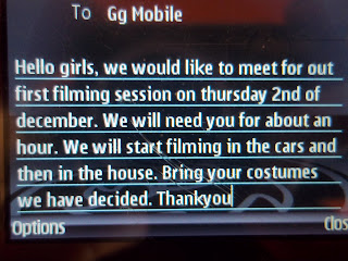

Above is a screen shot image of the text that we sent round to everyone involved in the filming of our trailer. In the text we included information on the date we wanted to start film which was 2nd December, how long we would be filming for and what they needed to bring with them.
Unfortunately, on the day of filming due to extreme weather conditions we were forced to cancel our original date for filming. Once most of the snow had cleared up and it was safe for us to travel, we decided to schedule another date for filming. Instead of sending a group text, we decided that a better way to communicate with the group wold be through a thread (email) on the extremely popular social networking site, Facebook:

We decided on sending an email round because it allowed us to have a group discussion on when everyone was free. We then decided that 7th December after school was the best date for everyone.
The plan is to leave school at 3:30 and meet at White Hill, this is where we will film the first part of the trailer in the car. After this we will then move to Caterham Valley where the house is located. We will continue filming the rest of the scenes and then finish this with the woods scene which is opposite the house. It is crucial that we film all of the shots that we need in one go, this is so the continuity of the trailer is acceptable.
Subscribe to:
Comments (Atom)